Module 7 - Using the Seeing Reason Tool to Target Thinking Skills
Activity 7.2
Step 3: Helping Learners Understand Causal Relationships Using the Seeing Reason Tool
Before learners work on the “real” causal map for the project, it may be helpful to have them practice on a simple causal map. This will help them to better understand cause and effect, as well as become familiar with the Seeing Reason Tool. An easy way to practice with a map is to go to Seeing Reason and discuss and work with the sample map.
Open Seeing Reason from your Favorites. (www.intel.com/education/seeingreason)
Click Try the Tool
-
On the page that opens, click Demo.
-
You can use the sample map about traffic jams to help your learners understand the meaning behind the visual construction of the map. Have learners use the Intel® Education Help Guide as needed to understand how to use the Seeing Reason Tool.
Double-click factor boxes and relationship arrows to read their descriptions.
As a whole group, discuss factors that could be added to the map.
Add factors and relationships to the map and type more detailed explanations in the description fields.
Discussing the Traffic Jam Map With Your Learners
The following is one way of demonstrating to your learners how to read the map and use the features of the Seeing Reason Tool.
The sample Traffic Jam map on the Seeing Reason site (also shown below) shows one learner team’s ideas of the cause-and-effect relationships involved in traffic jams. The map has both simple relationships (e.g., As the number of trucks increase, traffic jams increase) and complex ones that show a chain of factors (e.g., As snow increases, accidents increase; and as accidents increase, traffic jams increase).
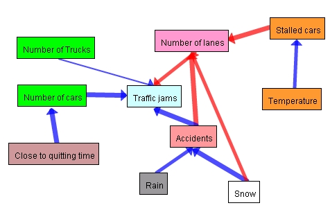
On the causal map above and on the next page, you will notice arrows of different thicknesses.
Thicker arrows show a stronger relationship.
Thinner arrows show a weaker relationship.
Blue arrows indicate positive relationships (as X increases, Y increases).
Red arrows indicate negative relationships (as X increases, Y decreases).
By moving your cursor over a relationship arrow, the description of that relationship will appear at the top of the map. By double-clicking an arrow, you can view the full relationship description. This is where the learners will either present their theory of the causality of the relationship (in an early map) or their evidence to support their claim, including their sources of information, such as Web sites, specific bibliographic citations, quotations, lab results, and so forth (in later revisions).
By double-clicking a factor box, you can view the full factor description that could include a more detailed description or definition of the factor, a description of how the factor is measured or quantified, sources or Web addresses for information on that factor, and so on.
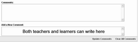
Scroll down below the map to view the Comments box. This feature allows learners to communicate with other team members when they are working on the map independently, as well as to communicate with the teacher to discuss questions, problems, insights, or recent updates. Teachers can use the Comments feature to ask questions of their Student Teams to help them clarify and evaluate their own thinking, question their assumptions, and broaden or narrow their focus.
| Note: If you are interested in seeing how this practice map can be part of a larger classroom project, see the tutorial section of the site. |
Having Your learners Create a Practice Map
You can have your learners go to Try the Tool section of Seeing Reason and in partners, have them brainstorm factors and create a new map that investigates a question that does not require much prior knowledge, such as “What affects a learner’s grades?” Provide the following instructions. Use the Intel® Education Help Guide as needed to complete any technology skills identified below.
Click the Clear the Map link at the bottom right of the Demo map screen.
Add factors and relationships that explore the causes of learner grades. As you create cause-and-effect relationships, remember that the first factor in the equation always “increases.” This is not a limitation of the tool, but rather is necessary so we can accurately interpret the map visually. Below are some examples of how to change a “decreases” statement into an “increases” statement.
| Inappropriate Wording for Seeing Reason | Appropriate Wording for Seeing Reason |
| As attendance decreases, grades decrease. | As absenteeism increases, grades decrease. |
| As parent involvement decreases, grades decrease. | As parent involvement increases, grades increase. |
| Note: The choice of colours for the factors is determined by the map creators. If working in a team, you may want to have a discussion with your team member(s) about whether the colours of your factors will have any special meaning. |
- Learners can use the Help Guide or the Need help? link at the top right of the map for further instruction.
